There are so many variations of covers for Good Omens that I couldn’t rest easy just picking one. So, instead, we’re going to have a look at a few of them. After a thorough analysis of them, we’ll find out which one works the best.
First up is the simplest.

At first glance, there isn’t a lot to talk about here. It’s mostly just credits, the title, and a small illustration. But there are a few more details here that you may have missed.
First of all: the backgrounds. These aren’t just made to make the characters pop. They’re symbolic of the dual-sided nature of these characters. Aziraphale, the angel, is surrounded by darkness despite being drawn as pure and white as snow. Meanwhile, Crowley, the demon drawn in black, is surrounded by white, hinting that there is some level of purity to him beneath the surface.
Then there is what each character is holding. Aziraphale, a red book, Crowley, a cup of red wine. These are the only two colors that both versions of the cover share. Coincidentally, they are also two items that tie these two characters together. In the book, the angel and demon share wine and they both share a book into ‘The Nice and Accurate Prophecies of Agnes Nutter, Witch’, which is likely the book Aziraphale is reading (although it also may not be, given his calm and happy expression).
So, this cover doesn’t have much. But it could be interpreted to have more depth than it appears. Plus, it’s nice, clean, and pleasing on the eyes.
Unlike this one.
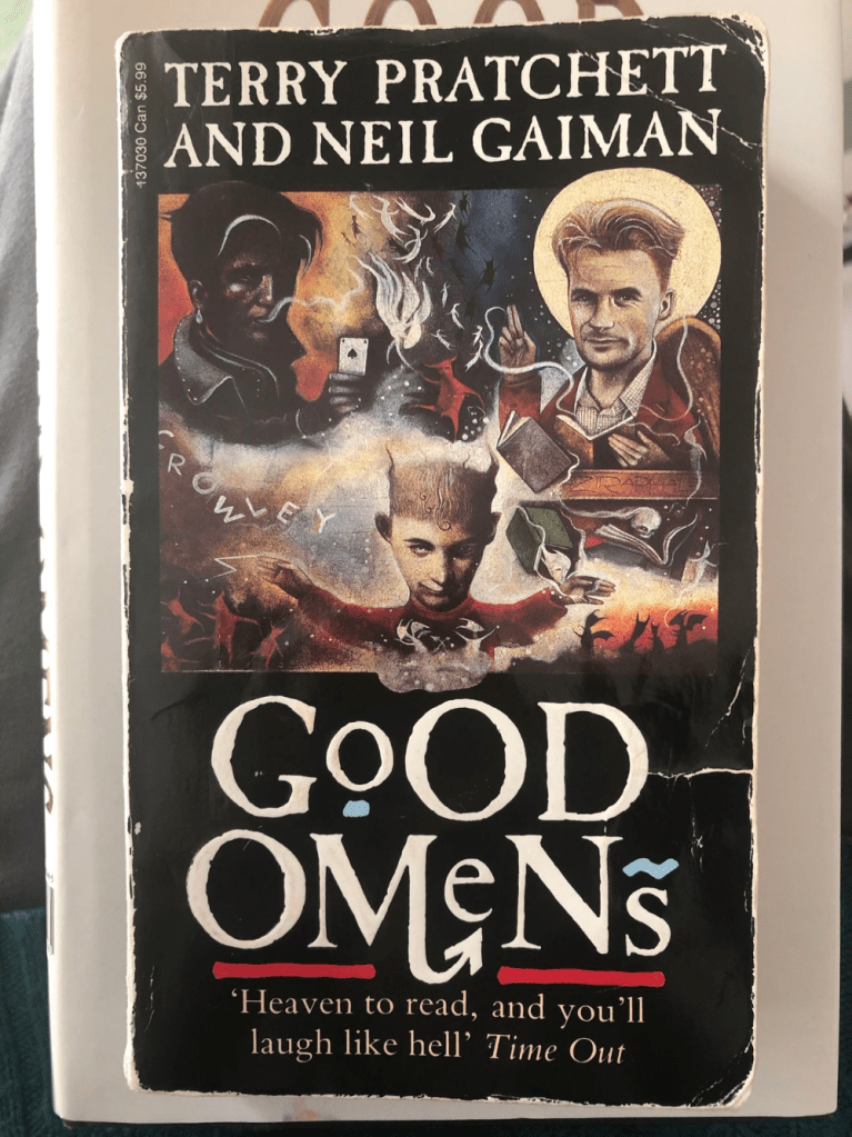
I could find
Okay. This version isn’t necessarily terrible. But it isn’t exactly all that pleasing to look at, either. The illustrations, while well-done, is a bit… cramped. And the character’s heads are much too big for their tiny bodies.
Let’s break down the obvious. Firstly, in the top right and left corners of the page, we’ve got Aziraphale and Crowley respectively. Aziraphel is surrounded by books, as he owns a book shop, and Crowley… is holding a card and has his name spelled out beneath him? Gee, what interesting and subtle hints as to his identity.
In between them is a drawing of an angel and a demon, likely symbolizing their true identities (note: the angel is on Crowley’s side while the demon is on Aziraphale’s, which could hint at the similarities between the two). At the bottom of the page, between them, is the Anti-Christ, the most important player in the story (what’s wrong with his face?) Surrounding him are little depictions of shadows backdropped by flames, likely the armies of hell.
Again: this cover isn’t bad. It is still a somewhat clever and interesting depiction of the story held within the pages beneath it. But it’s so cramped that it’s hard to focus on anything. Not to mention how odd and unappealing the characters look. Honestly, if I saw this, I’d have stayed away from this book, not gone towards it.
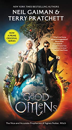
Thankfully, there is another version. And this one is pretty solid.
did it take to make this? Probably
an impressive amount.
Now, yes, this may be seen as cheating. This is another case of a publisher slapping the movie/TV show poster onto the cover to make it more easily recognizable for people who watched the film version first. It may as well have the actor’s names plastered beneath their characters.
But fuck me, dude, this cover is so damn good! It’s simple, it’s clean, and it’s pleasing to look at!
From left to right, we’ve got Aziraphale and Crowley. One look at them gives you all you need to know about their characters. Aziraphale is poised, composed, and proper. Crowley is casual, relaxed, and probably mischievous. However, despite their differences, the two sit close, shoulder-to-shoulder, conveying the fact that they are allies in the adventure contained within the pages.
Their surroundings hint at their true natures. Aziraphale’s side of the earth is lush, green, and peaceful. Meanwhile, Crowley’s side is a charred, burning hellish nightmare. Perfectly suited for an angel and a demon.
It’s worth noting, however, that the hellfire covers 3/4ths of the page while the calm blue sky only covers 1/4th of it. A clever little hint as to the approaching battle between heaven and hell, perhaps?
Sitting between them is a simple tree with a single apple hanging over Aziraphale’s head. This hints at the shared origin of these characters. How Aziraphale was the guardian of the Garden of Eden and Crowley was the snake. Interestingly, a divine apple hangs over Aziraphale’s head while there is none over Crowley, likely hinting at their involvement in the old Bible tale while also serving as a subtle hint as to their identities of angel and demon.
However, I do feel that this sort of detracts from the presentation of the characters presented by the previous covers. There’s nothing to hint at the similarities the two share, such as Aziraphale’s mischievous nature and Crowley’s kindness. It presents it more like ‘opposites attract’ rather than showing that these two aren’t as different as they appear, which is why they get along so well in the first place.
Still, this is my favorite version of the cover. Yes, it’s a TV tie-in cover. But it’s a very nice one to look at. So, if I had to have one on my shelf, it would probably be that one.
Although the first pair isn’t all that bad either.

Leave a comment