How long has it been since I looked at a cover? The answer is too long. Let’s fix that!
Dune as a book is incredibly dense. There is so much world-building and lore crammed into this thing that the story straight-up becomes confusing. You’ve got the worms, the Spice, the unique inhabitants of the planet, shield belts, the suits, you’ve got a ton of cool sci-fi shit to remember. And that’s just on this planet!
Which makes this cover all the more disappointing.
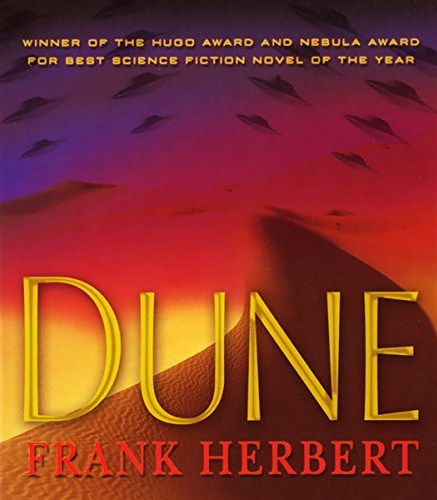
Let’s look at the positives first. Right away, you can tell where this book is gonna be set. The curving hills of the desert are kind of hard to miss. Then, when you look up and see all the spaceships (which look incredibly generic and boring but oh well), you can quickly piece together that this is a sci-fi story.
The colors on display are a bit strange to me. Is it supposed to be the sky? Then why is it covering the ground? Is it like some kind of haze? I can’t really tell what it is.
It does, however, give a sort of bizarre and otherworldly feeling to the artwork. Not only does that work well for the fact that this is an alien world, it also hints at the bizarre tone of the story. There are a lot of acid-trip like scenes in this book. There are way better ways to communicate that, but the strange use of colors here is certainly a way.
Unfortunately, this cover doesn’t do a whole lot with all that’s presented to it. The artists had so much to work with in this book! Why not put a worm somewhere? Or maybe one of the mining vessels that Paul and his father save early on in the story? Hell, you could just stick a dude with all-blue eyes on there and it would be better than just ‘desert with UFOs’.
This isn’t the worst cover I’ve ever seen. It at least has something of substance to discuss. But it is a huge example of missed potential, considering all the cool stuff this novel’s world has to offer.

Leave a reply to The Otakusphere: Likes, dislikes and that’s just your opinion, man – In Search of Number Nine — An anime blog Cancel reply